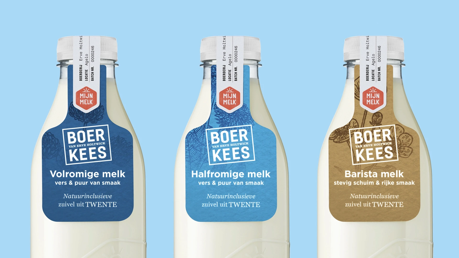
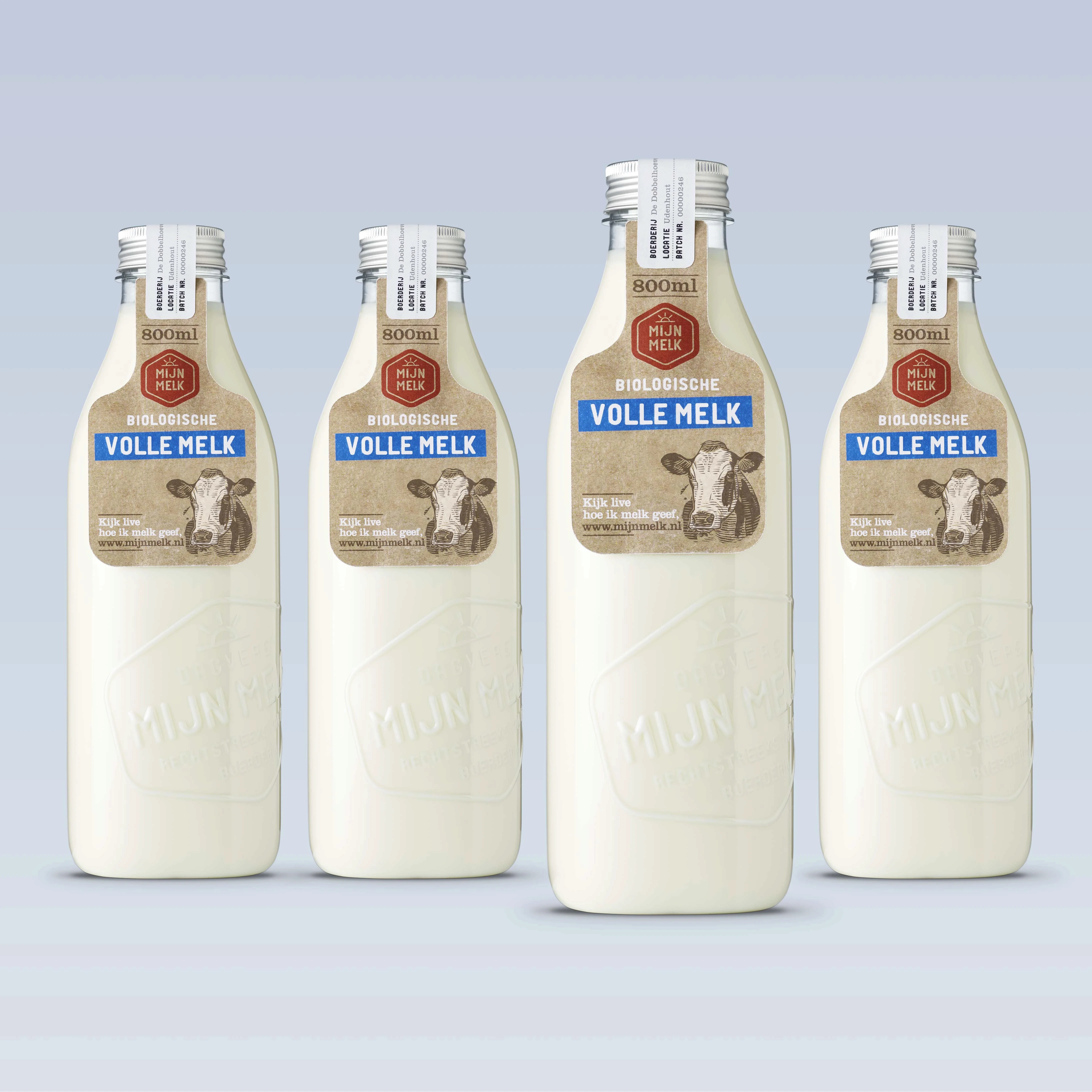
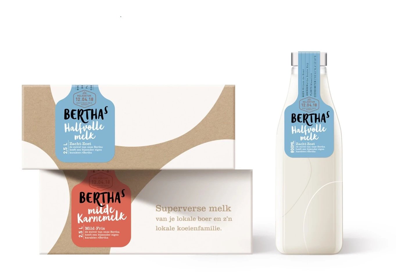
We designed this iconic new milk brand and created an integrated packaging design that embodies fresh, honest, and pure milk delivered directly from farmer to supermarket.
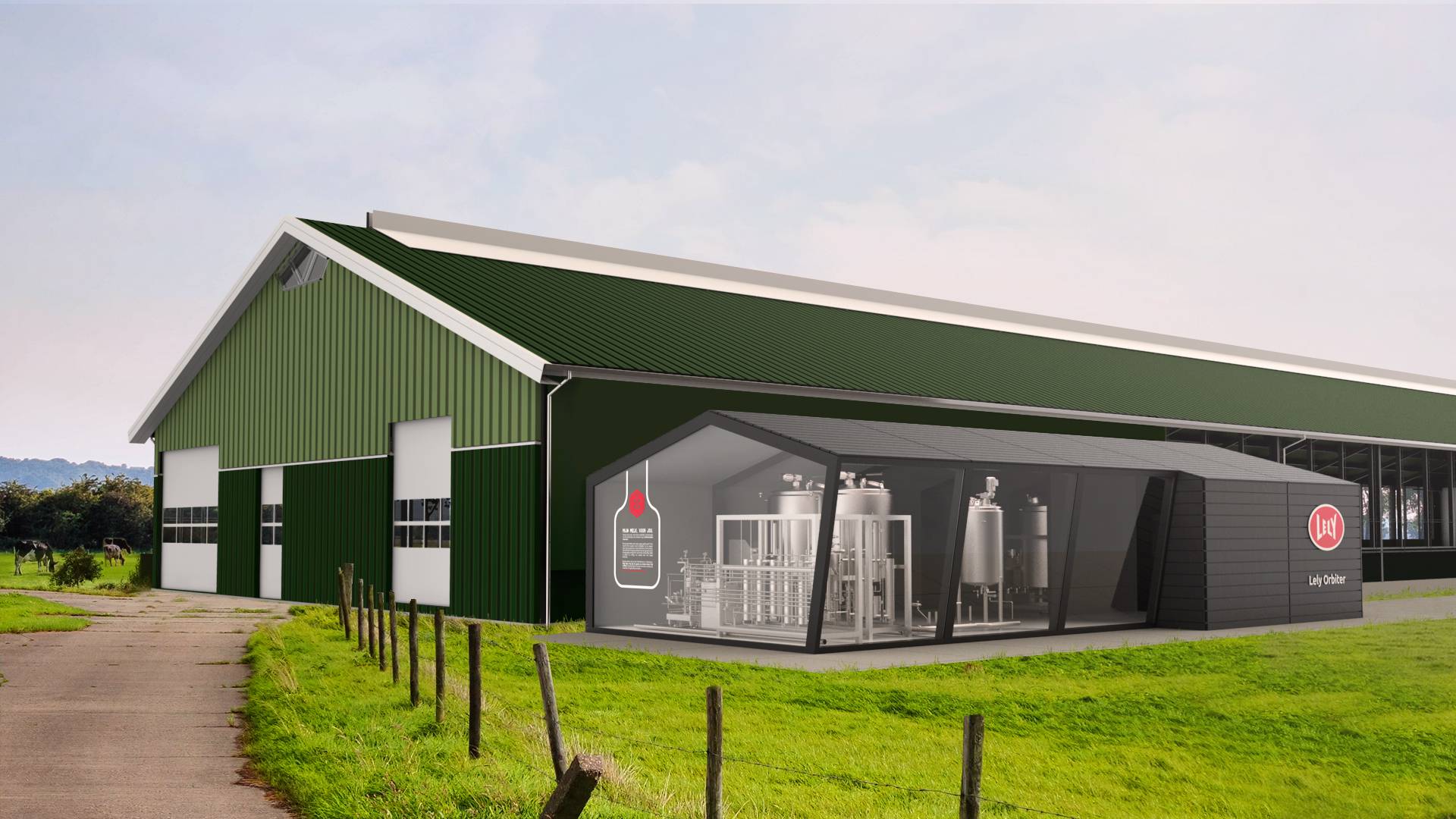
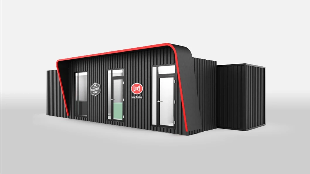
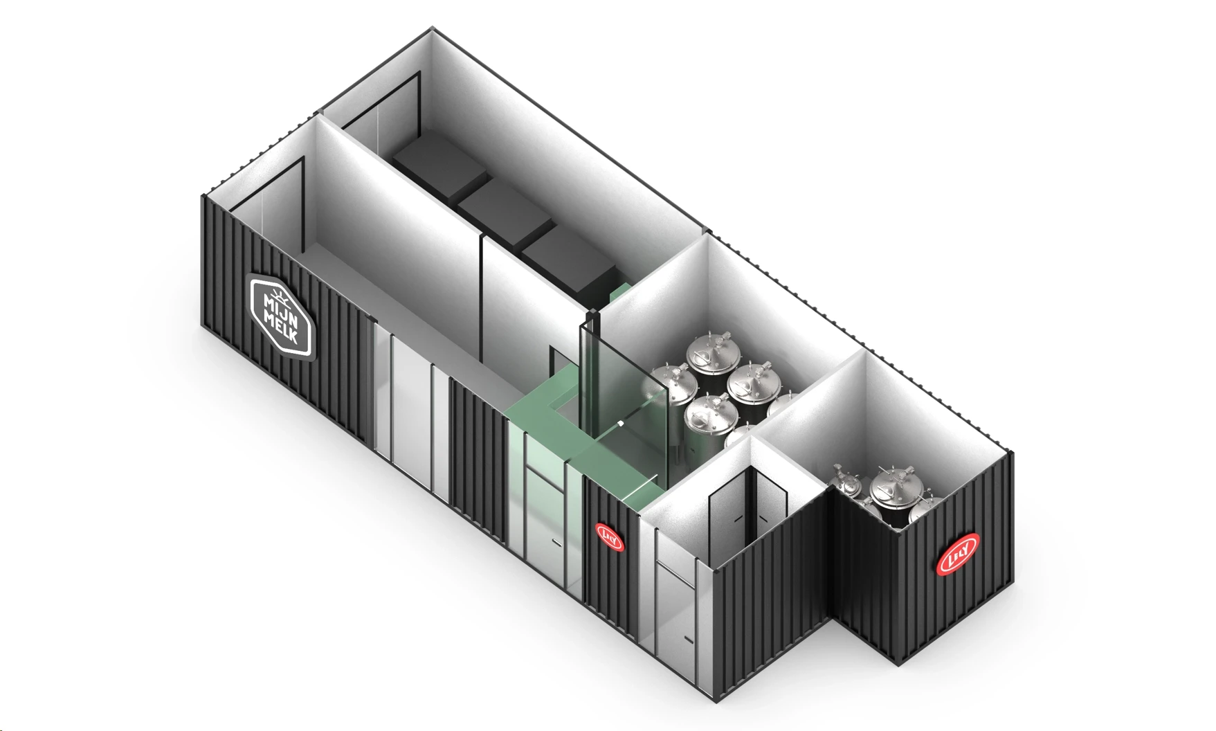
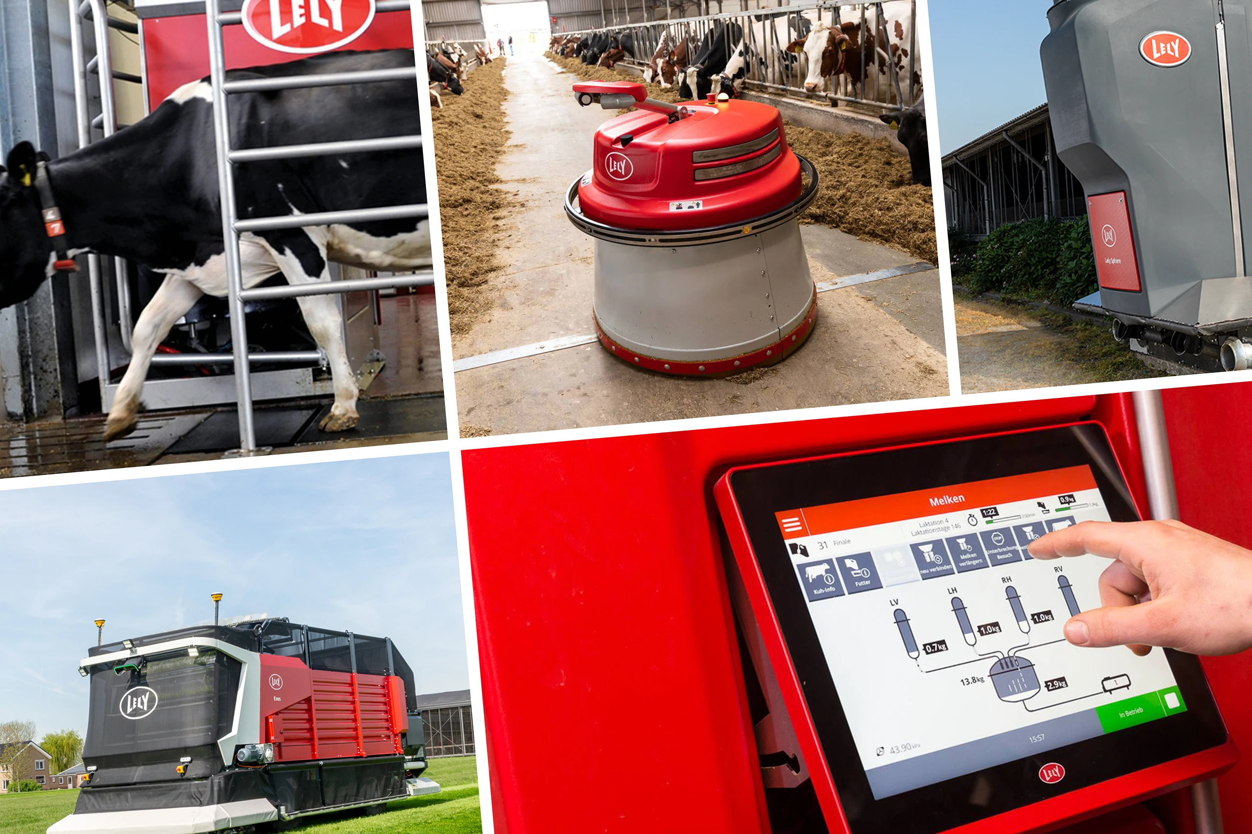
Lely initiated a technical innovation that brings a radical change in the logistic chain: full-cream milk, unique in taste and composition, being supplied directly from the farmer to the supermarket. The milking robots in the stables recognize the animals and send their milk over to the Lely Orbiter, a mini dairy factory on the farm. Here the milk from cow families Aukje, Kitty, Cootje, Moevken is pasteurized and bottled separately. Our challenge: How to design a brand and packaging that tells this story and will be embraced by consumers?
In close collaboration with Lely and other experts, our team worked on the proposition and selected the format. The name ‘Mijn Melk’ refers to the very origin of the product, the cow. We created the structural and graphic design of this premium product’s packaging that embodies this extraordinary story.
The designers’ technical challenge was to develop a packaging that enables filling and labeling at the farm without huge investments. Furthermore, the packaging design should communicate its extraordinary concept; pure, honest daily fresh milk from different cow families, unique in composition and taste experience.
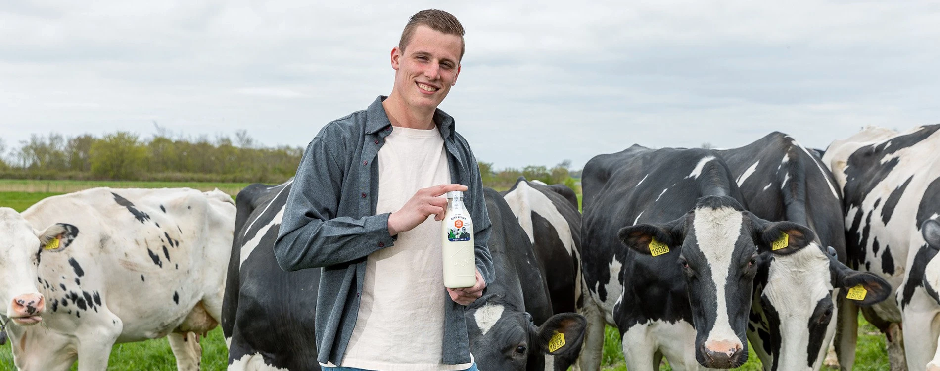
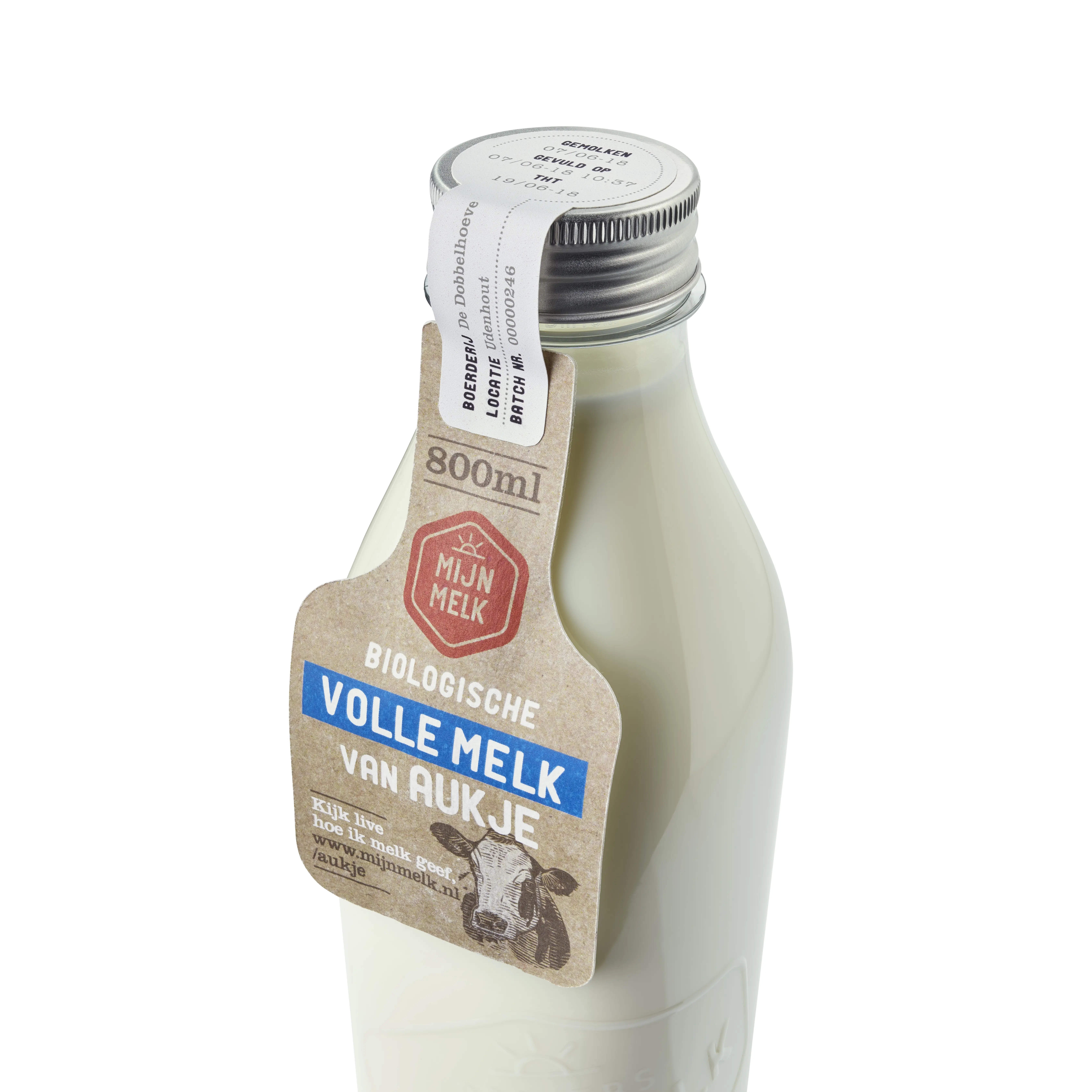
We created an iconic PET milk bottle, which refers to the good old glass milk bottles, definitely a premium quality product in the perception of consumers. The aluminum cap contributes to a truly ‘premium’ feel and craftsmanship.
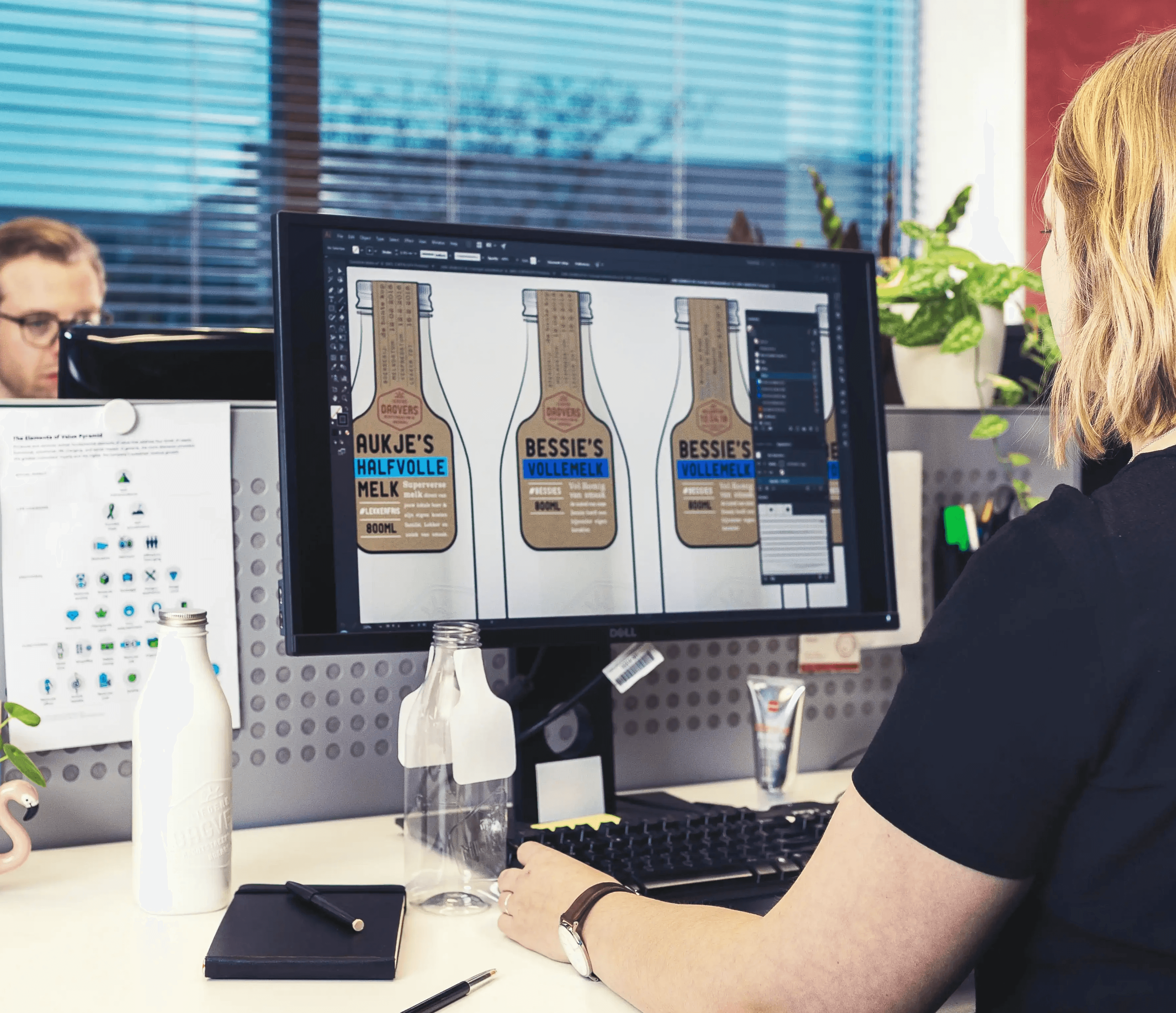
Long-term collaborator Danny Klein helped us with the right graphic touch. Together we chose a free neck label that proudly mentions the names of the selected cow families, even showing their portraits. A seal closing the bottle’s cap indicates the date of filling and expiration date. It brings consumers closer to the farmers, to the origin of a pure, honest and genuinely fresh dairy product. The recognizable red brand logo is reminiscent of a quality seal and easy-to-use digitally.
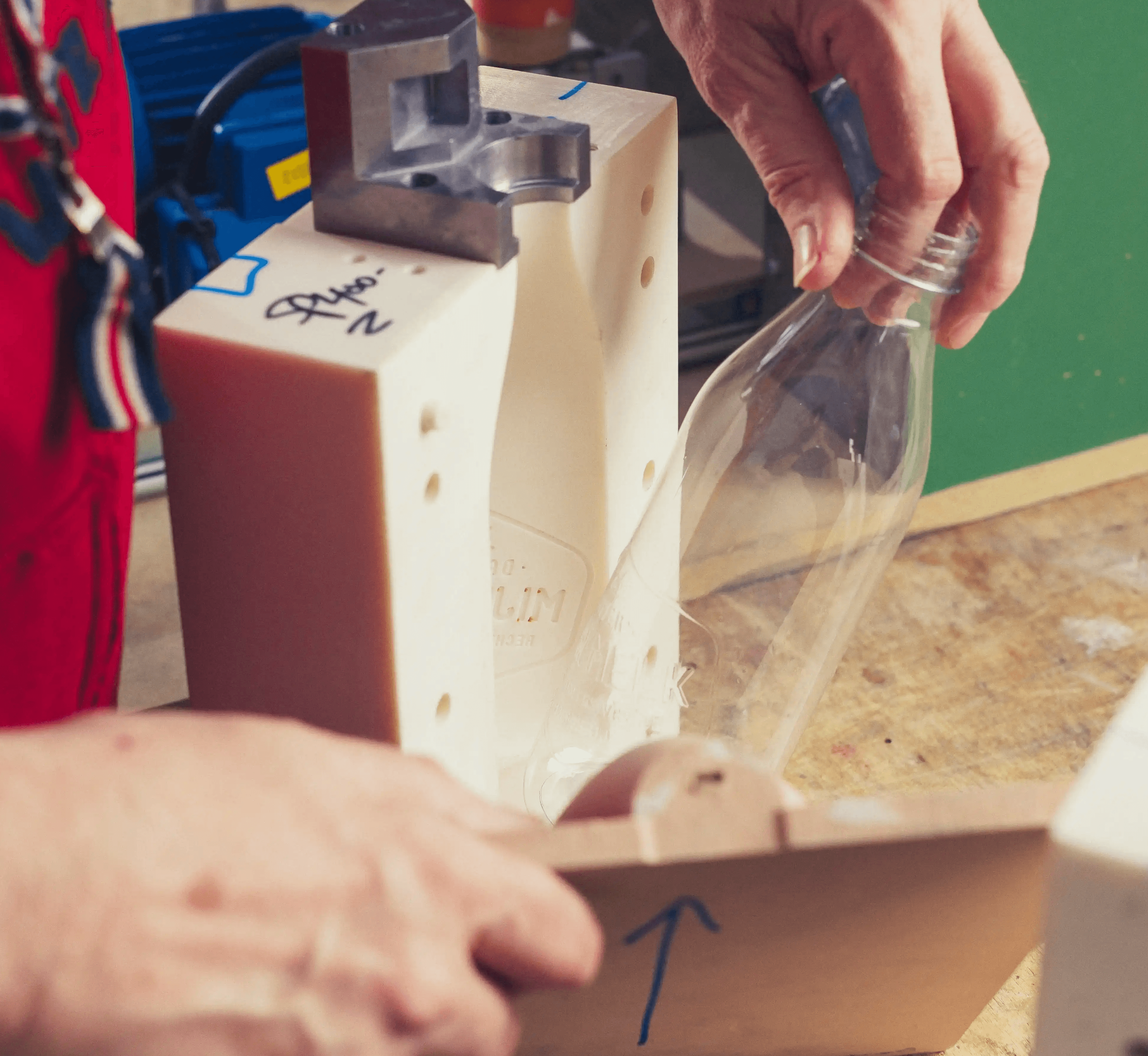
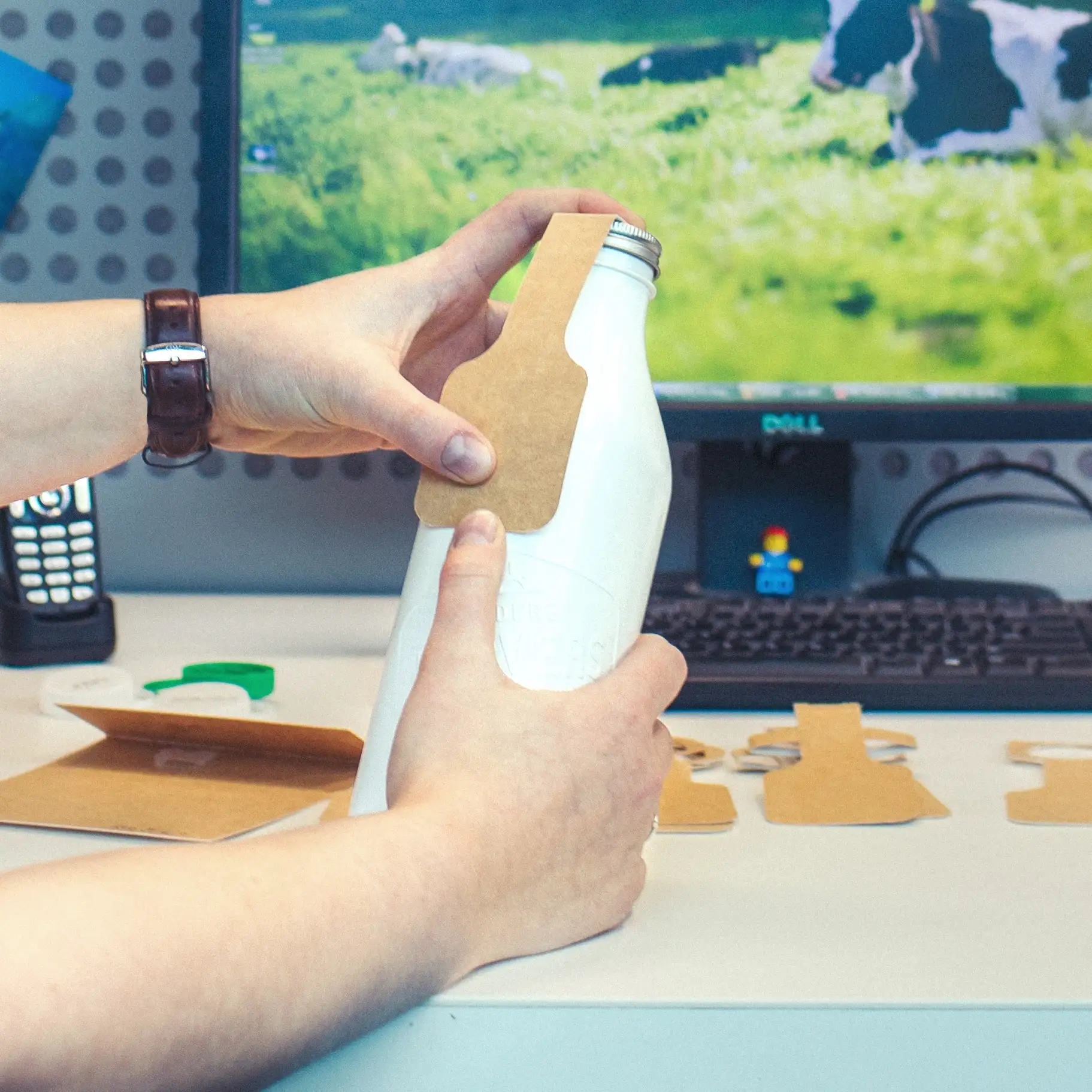
Prototyping in an early stage of our design process helped us to evaluate each step for bottle and label. In-house we made several solid mock-ups, and with our unique blow-molding equipment, we made a transparent and fillable bottle. Together with the prototypes of the labels, this resulted in a realistically looking model of the milk bottle, which helped us enormously in evaluating and presenting our concepts.